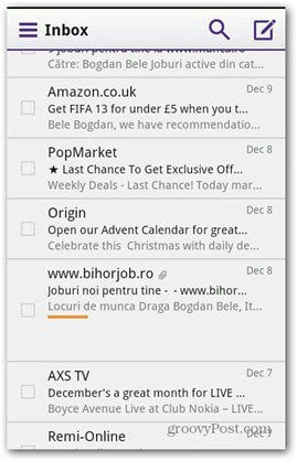
The interface has been redesigned, with less buttons with the idea to give users more speed. Yahoo says that getting to messages is now a faster process and that the inbox is easier to use and more intuitive. The new version will be rolling out to users in the next few days, so it won’t be long before you get to use it. Now, here comes the interesting part. Yahoo wants to make the email experience consistent across the devices you’re using. So the apps coming with the company’s webmail interface have the same interface (or let’s say it’s designed with the same ideas in mind). There’s an all-new iOS app, which you can in the App Store, as well as a Windows 8 app (pictured above), which is available in the Windows Store. The Android app has been redesigned, too. I’ve tried it and I can say it looks pretty smooth and works really fast. It reminds me a bit of the Gmail app for Android, but don’t tell Yahoo I said that!
I liked the menu that pops up when you push the button on the top left corner, allowing you to get to your folders and settings easily. I think it’s a pretty good idea to have it.
I also liked the fact that, when you reply to an email, you have a photo icon, which allows you to attach an existing photo, or take a photo or a video and send it to the recipient directly.
Whether this leads to a mass exodus from Gmail remains to be seen, but I think Yahoo is on the right track with the mobile app and new design. Comment Name * Email *
Δ Save my name and email and send me emails as new comments are made to this post.


